Visual identity, brand voice, print and digital collateral for Axomind, an industrial automation platform turning factory workflows into autonomous systems.
Axomind needed to communicate hard technical credibility to engineers, investors, and partners, without defaulting to the generic industrial look. The identity system is built around amber as a single commanding accent, a restrained palette drawn from factory materials, and a typographic stance that signals precision over decoration.
Color
Amber is Axomind's primary accent, the color associated with their robots and the one that makes the brand instantly recognizable. Secondary colors support dark surfaces, status states, and print backgrounds.
Industrial Amber
#F59E0BCharcoal Black
#141413Ivory Warm
#F5F5F0Machine Steel
#334155Slate Foundation
#E2E8F0Circuit Green
#188A5EPrimary typeface for headings, navigation, and body copy across print and digital. The variable weight axis runs from light to black.
0 1 2 3 4 5 6 7 8 9 ! @ # $ % ^ & * ( )
into parts.
Used at Regular for long-form editorial and Bold Italic for brand narrative and founder voice.
therefore I am."
Wordmark
The logotype holds up across dark, light, and steel backgrounds without modification. Each approved version was tested for print and screen at every scale.


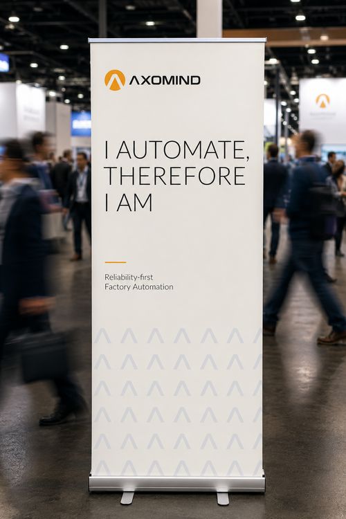
"I automate,
therefore I am."
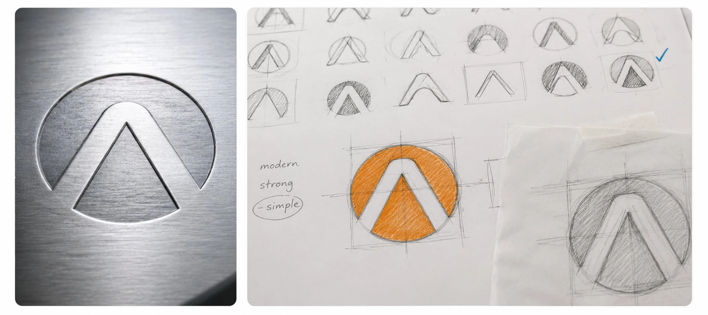
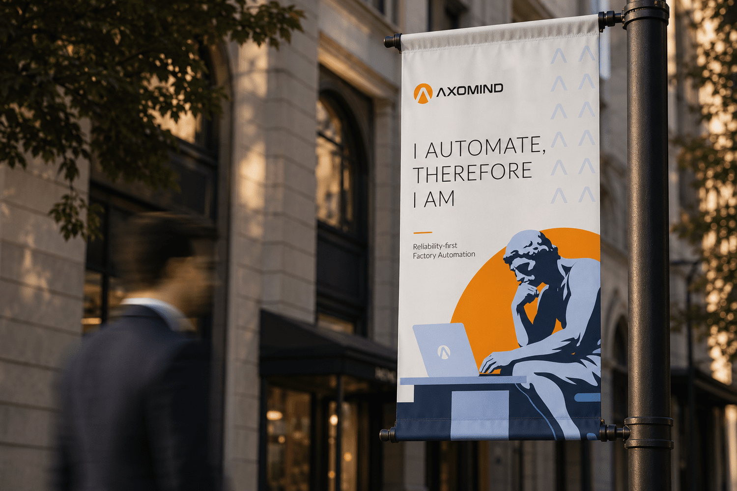
The CEO's belief is straightforward: automation is not a competitive advantage, it is the baseline every business will eventually need to reach. That conviction shaped the verbal identity. The line "I automate, therefore I am" grew out of conversations with the founding team and became the phrase that carries the brand across print, digital, and the objects their customers actually touch.
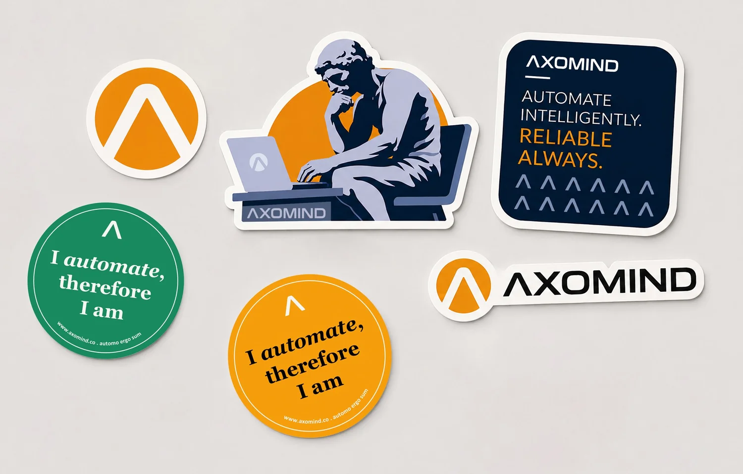
Stickers & Merch Graphics
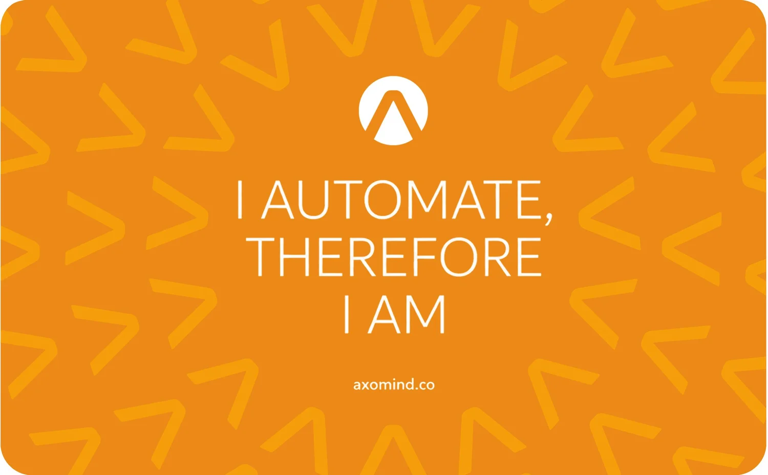
Stickers are the cheapest piece of brand real estate that follow hardware into the field. The "automo ergo sum" sticker, Axomind's Latin riff on the brand narrative, was designed to sit on laptops, equipment cases, and factory workstations, keeping the brand present long after first contact. The amber circle format was chosen to stand out against the predominantly dark and neutral surfaces in industrial environments.

Stationery System
Developed as an initial brand touchpoint for upcoming exhibitions and partner outreach. A spot UV treatment on the A-mark adds a quiet layer of depth without distracting from the information.