
Brand identity, website design, and presentation frameworks for Stanford Emergence, a program accelerating healthcare entrepreneurs at the School of Medicine.
Working closely with the founding team, I developed a cohesive brand system rooted in Stanford's visual heritage, giving Emergence a modern identity that stands confidently on its own across digital, print, and co-branded materials.

Wordmark
The wordmark is set in Montserrat and uses a gradual progression in weight across the letterforms, creating a sense of forward movement and growth. Rather than relying on color alone, the increasing typographic density reinforces the ideas of emergence, momentum, and accelerating impact.
Color &
Typography
The palette balances institutional recognition with a more contemporary health innovation language. Cardinal Red anchors the system in Stanford, while Lagunita, Poppy, Charcoal, and supporting neutrals create range for digital pages, presentations, calls to action, and event materials. Montserrat keeps the system consistent from the wordmark to body copy.
Cardinal Red
#8C1515Lagunita
#007C92Off White
#F5F5F0Charcoal
#2E2D29Poppy
#E98300Slate Blue
#3C5F76Cool Grey
#53565AType System
3 typefacesstanfordemergencesummit.org
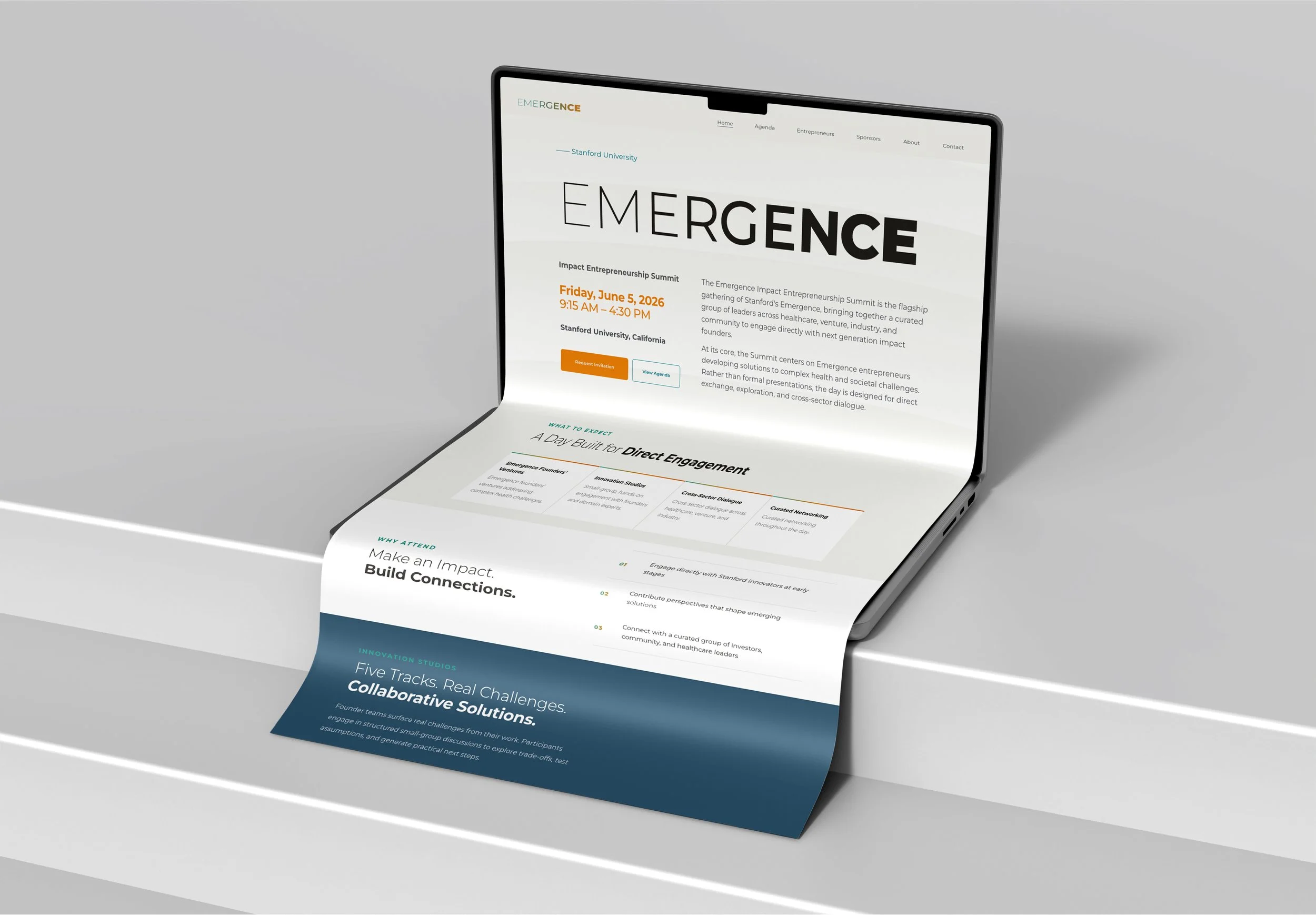
A custom-coded digital experience — home, agenda, entrepreneur profiles, sponsor listings, and contact. Built with tailored animations, refined interaction details, and brand-consistent layout systems.
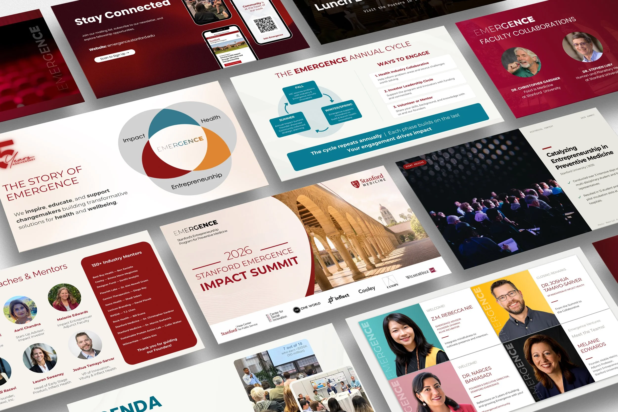
Slide Templates
Templates for Keynote, Google Slides, and Canva, so the team can communicate research, partnerships, and impact through a consistent visual language that is easy to maintain and adapt.
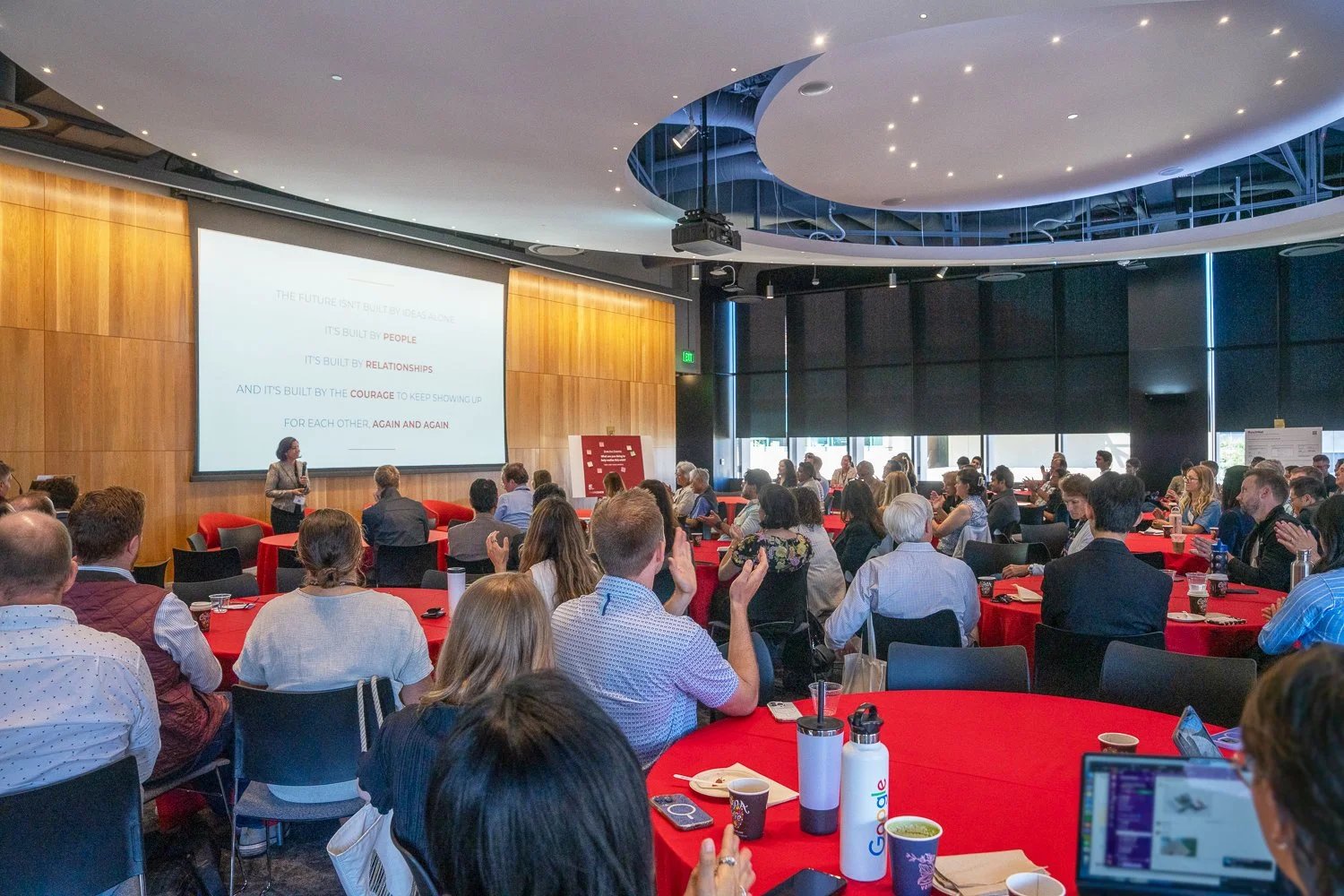

Emergence brought together health entrepreneurs, investors, and researchers committed to translating innovation into lasting impact. Five years in, the momentum is only growing.