StudyHub — Tina Korani
StudyHub
StudyHub
Case Study.

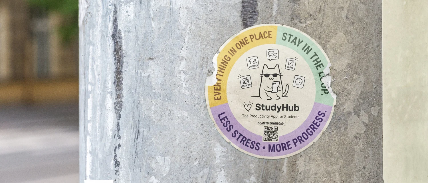
A mobile-first redesign of the StudyHub, addressing the anxiety, friction, and cognitive overload students experience every day. Currently being developed for further testing.

UX Design Mobile In Development
About the project
Students check Canvas up to 15 times a day. Most of those visits end in frustration.

Canvas is essential but exhausting. Every professor organizes it differently. Deadlines hide in announcements. The mobile app crashes. Through research with 32 students across three universities, a clear picture emerged: the problem isn't features, it's friction. This redesign strips back the complexity to focus on what students actually need — a clear view of what's due, what's new, and what matters most.

32
Students interviewed
78%
Feel overwhelmed by the interface
67%
Have missed deadlines due to poor UX
45%
Faster task finding after redesign
StudyHub street banner
Primary research

32 students, 3 universities, 4 weeks.

Students reported checking Canvas an average of 4 times daily, with peak usage on Sunday evenings and before assignment deadlines. The consistent finding: they don't want more features, they want less to manage.

4.2×
Average daily Canvas sessions per student
78%
Feel overwhelmed by the interface
67%
Have missed deadlines due to poor UX
What helps students most
Clear deadlines87%
Simple navigation62%
AI task assistance45%
Group collaboration37%
How students want to learn
Self-directed study45%
Visual learning37%
Group collaboration29%
User persona
Sarah Chen
NameSarah Chen
MajorComputer Science
YearJunior
LocationSan Jose, CA
Daily sessions15–20
Primary persona
Meet Sarah

Sarah is a junior CS major juggling 5 courses, a part-time internship, and campus activities. She checks Canvas 15 to 20 times daily, including before bed. She's not disorganized — the tool is.

Goals

Maintain her GPA without the constant background anxiety that something important has slipped through. She wants a tool that works with her, not one she has to manage.

Pain points

Every professor organizes Canvas differently. She spends 10 to 15 minutes per course each week just hunting for new content. She missed two assignment deadlines this semester because they were posted in Announcements instead of Assignments. The mobile app crashes when uploading files.

What she actually needs

One unified view of everything due across all courses. Notifications that only fire when something actually matters. A mobile experience that works reliably.

Journey map

A day in Canvas — and where the friction lives.

😟
Morning check
Anxiety
😤
Finding tasks
Frustration
😐
Doing the work
Focus
😌
Submission
Relief

01
Morning brief
An AI summary of what's due today and what changed overnight, before anxiety sets in.
AI Summary
02
Universal search
One place to find anything across all courses, regardless of how a professor structured their page.
Navigation
03
Focus mode
A distraction-free working state that mutes everything except the task at hand.
Study tools
04
One-tap submit
Submission that works on mobile, with clear confirmation so students know it landed.
Interaction
Design process
01
Discover
32 student interviews across 3 universities over 4 weeks. Finding out what actually happens when students open the app.
InterviewsSurveys
02
Define
One clear problem: the tool creates anxiety instead of resolving it. Every decision after this point was tested against that framing.
Affinity mappingPersona
03
Prototype
AI task prioritization, unified deadline view, mobile-first. High-fidelity prototypes tested with 50 students.
WireframesDesign system
04
Test
A/B testing showed 45% faster task completion. Currently in development for further testing.
A/B testingIn development
Design strategy

Less anxiety. More focus.

The goal was not to add features. It was to reduce the moments that spike anxiety throughout a student's day.

Current state
anxiety threshold

Repeated anxiety spikes throughout the day

Redesign goal
anxiety threshold

Calm, consistent baseline throughout the day

Results

What the testing showed.

45%
Faster task completion
vs baseline
67%
Fewer missed deadlines
critical improvement
52%
Drop in reported anxiety
post-redesign
85%
Mobile task success
up from 34%
40%
More daily engagement
active sessions
+42
NPS score
promoter territory
What comes next

Three phases to roll it out.
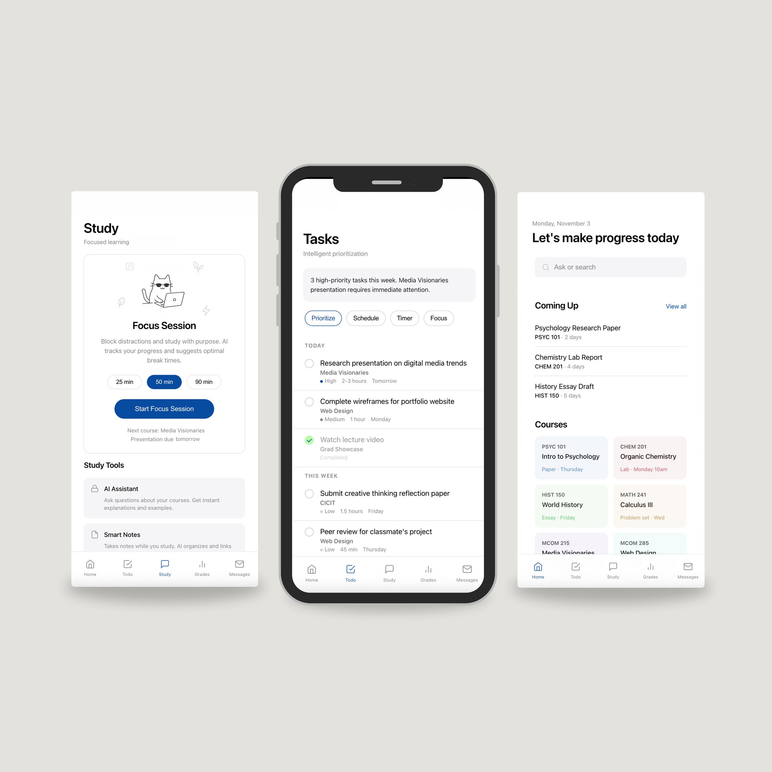
1
Foundation
Months 1-3
  • Unified dashboard
  • Smart notifications
  • Mobile parity
  • Testing with 100 students
2
Intelligence
Months 4-6
  • AI task prioritization
  • Deadline prediction
  • Assignment Q&A bot
  • Study path suggestions
3
Scale
Months 7-12
  • Institution-wide rollout
  • Professor onboarding
  • Performance tuning
  • Ongoing iteration
Key screens

Five screens. One job each.

StudyHub screens
Home
Unified deadlines and course grid
Tasks
AI-powered prioritization
Study
Focus timer with growing plant
Grades
GPA and performance tracking
Messages
All communications in one place
StudyHub sticker
Where it stands

Still in the works. Feedback welcome.

StudyHub is an ongoing project. The early testing results are encouraging but there is more to learn. The next step is gathering more feedback from students across different majors and course loads to see what holds up and what needs rethinking.

The team
Tina Korani
Creative Director, UX Research and Design
Alireza Hamedbaghi
App Development, CS Student
Mahsa Damadifar
Research Assistant, Psychology Graduate Student