Canvas, Reimagined
Primary Research
I conducted surveys and interviews with 32 students from 3 universities over 4 weeks to understand their relationship with Canvas LMS. Students reported checking Canvas an average of 4 times daily, with peak usage on Sunday evenings and before assignment deadlines.
How students want to engage
What helps students connect
Design Process
Based on the research findings, I learned that solving the Canvas problem requires more than surface-level UI improvements. Students need a fundamental rethinking of how academic information is organized and presented. I began by empathizing deeply with students to understand their daily struggles and motivations.
User Persona

Meet Sarah
Sarah is a junior CS major juggling 5 courses, a part-time internship, and campus activities. She checks Canvas 15-20 times daily, including before classes, between meetings, and late at night. She's constantly worried about missing important updates buried in course modules or professor announcements.
Goals
She wants to maintain her 3.8 GPA while reducing academic anxiety. Sarah needs a system that proactively helps her stay organized without requiring constant vigilance.
Pain Points
Each professor organizes Canvas differently. She spends 10-15 minutes per course weekly just hunting for new content. The mobile app crashes during file uploads. She's missed two assignment deadlines this semester because they were posted in "Announcements" instead of "Assignments."
Needs
• Unified view of all deadlines across courses
• Smart notifications that matter
• Mobile experience that actually works
• AI help for prioritizing overwhelming workloads
Journey Map
I mapped the emotional journey students experience when using Canvas throughout a typical day, identifying key pain points and opportunities for intervention.
The journey reveals that students begin each day with high anxiety about what they might have missed. This anxiety drives obsessive checking behavior throughout the day. By providing intelligent summaries and proactive notifications, we can transform this anxious vigilance into confident productivity.
Design Process
A systematic approach to understanding and solving the Canvas complexity problem
3 universities
4 weeks research
78% overwhelmed
67% missed deadlines
Unified experience
Mobile-first design
Interactive prototype
Design system
A/B testing
45% faster tasks
Design Strategy
Transforming anxiety into confidence through intelligent simplification
Students experience repeated stress peaks
Cognitive load stays below threshold
Success Metrics
Implementation Roadmap
A strategic three-phase approach to transform Canvas into a student-centered platform
- Unified dashboard MVP
- Smart notifications
- Mobile feature parity
- User testing with 100+ students
- AI task prioritization KEY
- Assignment clarification bot
- Predictive deadline alerts
- Personalized study paths
- Institution-wide rollout
- Professor training program
- Performance optimization
- Continuous iteration ONGOING
Cross-functional Partnership
Building bridges across teams to deliver holistic solutions
- Technical feasibility workshops
- API integration planning
- Performance optimization
- Mobile-first architecture
- Feature prioritization
- Success metrics alignment
- Roadmap coordination
- Stakeholder communication
- Predictive models development
- Usage pattern analysis
- A/B testing framework
- Performance dashboards
- Professor adoption strategy
- Training material creation
- Feedback loop establishment
- Support documentation
Key Screens
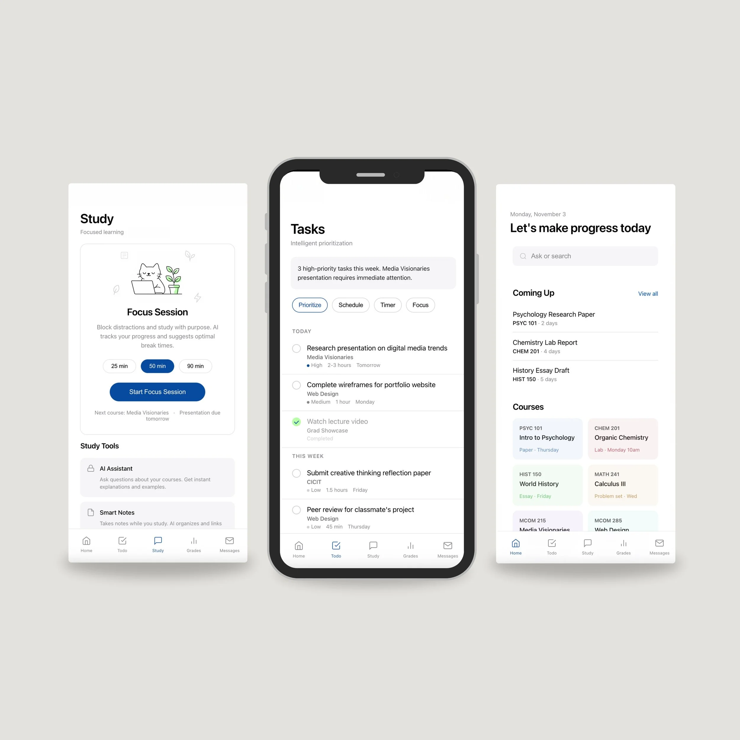
The redesigned Canvas experience across five core screens
Home
Unified deadlines & course grid
Tasks
AI-powered prioritization
Study
Focus timer with growing plant
Grades
GPA & performance tracking
Messages
Consolidated communication
Designed for minimal cognitive load with restrained colors and generous white space to reduce anxiety and improve focus.
Key Screens
The redesigned Canvas features five core screens: Home with unified deadlines and course grid, Tasks with AI prioritization, Study including a focus timer with animated growing plant, Grades showing GPA and performance, and Messages for consolidated communication. The minimal interface uses restrained colors and white space to reduce cognitive load.
Solution
Five core screens: Home with unified deadlines, Tasks with AI prioritization, Study with growing plant animation, Grades, and Messages. Minimal interface, maximum focus.
Next Steps
Early testing shows 45% faster task finding and 67% reduction in missed deadlines.
